Learn how to paint by rag rolling in this helpful DIY guide, which covers the materials you’ll need plus a step-by-step for creating your own distinct textures.

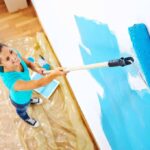
Rag rolling produces a mottled look with distinct lines. There are two ways to do it—with gloved hands and a twisted rag, or with a specialized roller. Rollers don’t reach into corners or narrow sections near doorways or windows, so you will probably need to do parts by hand even if you opt for a roller for the large expanse of a wall.
Materials and tools you’ll need:
* Base paint (eggshell sheen)
* Glaze
* Paint or universal colorant to tint glaze
* Painter’s tape
* Cotton T-shirt rags
* Disposable gloves
Step-by-Step Rag Rolling
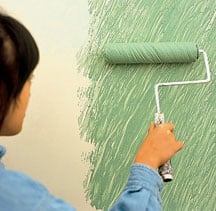
1 Apply two coats of base paint. When the final coat is dry, mask off all surfaces you do not want to paint. Also tape along adjoining walls because rag rolling deposits far more glaze into corners than other mottling methods do.
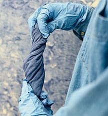
2 Prepare an opaque or medium glaze. Wearing gloves, dunk a dry rag into the glaze and twist the cloth so that it resembles a thick, short rope.
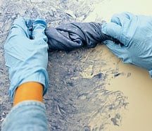
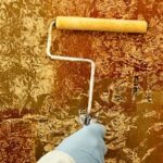
3 Roll the rag across the wall in random directions. When the marks become faint, reload the cloth with more glaze and continue rolling. Do not allow the rag to become too saturated or it will slip on the surface and smear the glaze. Also avoid using a freshly loaded rag along a corner because excess glaze may drip into the crease. Instead, gently push a fairly dry cloth into the corner.
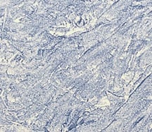
4 The final result shows a random pattern in the glaze.
The cloth cover is twisted to create a series of folds that leave their imprint in the glaze. With the roller, you can produce a network of diagonal lines.
But if you’re working in a small area where the roller won’t fit, you’ll need to glaze these sections by hand. In this case, roll in random directions so the two areas blend.
![]()
![]()