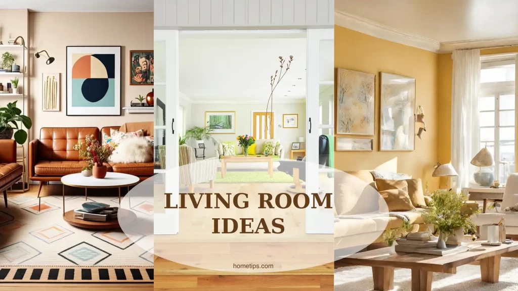
Or, begin with your favorite color, adding large doses of white or off-white, and perhaps using smaller amounts of one or two accent colors. Choose slight variations of the main color for a monochromatic room, or choose accents from the complementary color palette for more excitement.

How to use the principles of color for knock-out design schemes
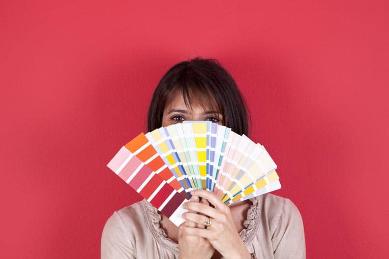
There are many starting points for choosing room colors, all equally valid. The easiest way is to take your cue from paint manufacturers, who offer brochures and color chips with specific suggestions on which colors to use together. These color choices needn’t apply only to paint; use them to choose fabrics and accessories as well.

A good rule of thumb is to use warm colors with warm and cool colors with cool. If you want to modify the color temperature of the room, however, choose from the opposite side of the color wheel.
Another way is to begin with a favorite fabric, rug, or object, drawing your colors from those chosen by design professionals. If the color combination seems overly bold for an entire room, vary the proportions or use paler shades to suit your tastes.
Some combinations are tried and true: one color plus white; blue and yellow; or red, white, and blue. These color schemes never seem to go out of style, even though specific shades may vary in popularity from year to year.
Professional interior designers have a way with color, producing attractive rooms time after time. This is because they employ the principles of color and adhere to some easy-to-follow color tips:
Pull rooms together with a thread of color. If you use a color in one room, then use at least a small amount of the same color in the next room. The entire house will be cohesive if varying proportions of the same color palette are used in all the rooms.
Use neutral shades for permanent features. Save bolder colors for walls or accents that can be repainted or replaced when you tire of them.
Don’t try to match shades exactly. When colors in a room share the same underlying tones, they are often more interesting if they almost, but not quite, match.
Balance the accent colors in a room. Complementary colors, in particular, look best when they are roughly equal in intensity. Use bright with bright, pale with pale, and dark with dark.
Think of contrast as well as color. Choose one predominant color, and select contrasting colors to serve as accents.
Use large doses of light or neutral colors. Let them separate the smaller and more vivid accent colors.
Enhance dark or bright walls by painting the trim white. The reverse holds true for light-colored walls. If woodwork is unimpressive, have it blend in by painting it the same color as the walls.
Group accessories in the same color for more decorative impact. If displayed together, they form a collection and will seem more important than if scattered around the room.
Draw attention to artwork by displaying it against a deep-toned wall. Choosing a color drawn from the painting will enhance the effect.
Keep pastel rooms from seeming overly pale. Throw in a bold dash of a deeper or brighter color to serve as an accent.
The Effects of Color on Mood
It makes sense to surround yourself with colors that make you feel good. Color creates emotion, according to common wisdom, so successful decorating partially depends on making appropriate color choices.

This has some scientific validity. It’s beneficial to select the colors that make you feel comfortable, happy, tranquil, energized, or whatever mood you hope to encourage. Bright orange walls, for instance, might keep you awake in a bedroom, but soft blue or warm beige would encourage sweet dreams.
Remember that there are many shades within a color family. By going lighter or darker, or by mixing in other colors, you can modify the emotional effects.
Following are the ways specific colors affect emotion:
• Yellow. Cheerful, intellectual, uplifting. Strong shades might be overwhelming and are best in smaller amounts, but light to medium shades can lift your mood like a room filled with sunshine.

• Green. Fresh, restful, rejuvenating. Like being out in nature, green can revive the spirit. The shade is important; blue-greens are calming and yellow-greens are more stimulating.
• Blue. Tranquil, homey, comforting. Unrelieved doses of pure blue seem cold and formal, but reddish blues or greenish blues are more inviting. Think Wedgwood, periwinkle, or turquoise.
• Purple. Creative, sophisticated, surprising. Paler shades like lavender are meditative, and darker ones like eggplant are artistic. This color was once reserved for royalty, giving rise to the term “royal purple.”
• Red. Bold, vigorous, exciting. Bright shades might be too stimulating, but dark shades seem elegant and classic. Pale pink is comforting and promotes feelings of well-being.
• Orange. Energetic, friendly, appetizing. Pure orange may seem jarring, but terracotta, pumpkin, and apricot are warm colors that inspire relaxation. This is a good color for rooms where people gather.
• Neutrals. Peaceful, reasoned, quiet. These soothing shades offer relief from brighter colors, separating them enough to keep their stronger energy in check. Light neutrals are harmonious and expansive, while darker ones are dramatic.